ShopDreamUp AI ArtDreamUp

Deviation Actions


Suggested Deviants


Suggested Collections


![[ ]](https://images-wixmp-ed30a86b8c4ca887773594c2.wixmp.com/f/35658d84-9937-43fb-8d7a-c3250c55d81e/d8a4ds3-096fb459-93da-441e-963c-0ff7e7a890ce.jpg/v1/crop/w_184,h_184,x_0,y_25,scl_0.28351309707242,q_70,strp/____by_kaze_hime_d8a4ds3-92s-2x.jpg?token=eyJ0eXAiOiJKV1QiLCJhbGciOiJIUzI1NiJ9.eyJzdWIiOiJ1cm46YXBwOjdlMGQxODg5ODIyNjQzNzNhNWYwZDQxNWVhMGQyNmUwIiwiaXNzIjoidXJuOmFwcDo3ZTBkMTg4OTgyMjY0MzczYTVmMGQ0MTVlYTBkMjZlMCIsIm9iaiI6W1t7ImhlaWdodCI6Ijw9OTk2IiwicGF0aCI6IlwvZlwvMzU2NThkODQtOTkzNy00M2ZiLThkN2EtYzMyNTBjNTVkODFlXC9kOGE0ZHMzLTA5NmZiNDU5LTkzZGEtNDQxZS05NjNjLTBmZjdlN2E4OTBjZS5qcGciLCJ3aWR0aCI6Ijw9NjQ5In1dXSwiYXVkIjpbInVybjpzZXJ2aWNlOmltYWdlLm9wZXJhdGlvbnMiXX0.kdWbDMLHrnseLbuNoVEMzlnMoqS4MEPv1Tjq9bz64vM)
![[ ]](https://images-wixmp-ed30a86b8c4ca887773594c2.wixmp.com/f/35658d84-9937-43fb-8d7a-c3250c55d81e/d8a4ds3-096fb459-93da-441e-963c-0ff7e7a890ce.jpg/v1/crop/w_92,h_92,x_0,y_12,scl_0.14175654853621,q_70,strp/____by_kaze_hime_d8a4ds3-92s.jpg?token=eyJ0eXAiOiJKV1QiLCJhbGciOiJIUzI1NiJ9.eyJzdWIiOiJ1cm46YXBwOjdlMGQxODg5ODIyNjQzNzNhNWYwZDQxNWVhMGQyNmUwIiwiaXNzIjoidXJuOmFwcDo3ZTBkMTg4OTgyMjY0MzczYTVmMGQ0MTVlYTBkMjZlMCIsIm9iaiI6W1t7ImhlaWdodCI6Ijw9OTk2IiwicGF0aCI6IlwvZlwvMzU2NThkODQtOTkzNy00M2ZiLThkN2EtYzMyNTBjNTVkODFlXC9kOGE0ZHMzLTA5NmZiNDU5LTkzZGEtNDQxZS05NjNjLTBmZjdlN2E4OTBjZS5qcGciLCJ3aWR0aCI6Ijw9NjQ5In1dXSwiYXVkIjpbInVybjpzZXJ2aWNlOmltYWdlLm9wZXJhdGlvbnMiXX0.kdWbDMLHrnseLbuNoVEMzlnMoqS4MEPv1Tjq9bz64vM)


You Might Like…


Featured in Groups


Comments29
Join the community to add your comment. Already a deviant? Log In
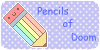
I want to do more critiques but they are so daunting ;A; Anyway:
This is really beautiful! The subtle brown hue of the pencil makes this picture feel as if it came right out of an old storybook. The anatomy on the human is perfect! The dragon is fantastic. The detail you put into the scales is marvelous! The dragon is super realistic! However, I think (compared to his snout) his jaw is slightly too long. It appears as if he has an underbite <img src="e.deviantart.net/emoticons/a/a…" width="19" height="19" alt="
The chain and the rider's hand are great! It looks like the chain is flying around rather than just hanging there. But where is the rider sitting? He kind of looks like he is floating. Is he having trouble staying on the unruly dragon? His right leg is missing too....
The wings are shaped perfectly, but the size of the left one is a little... odd. Compared to the right wing, it kind of looks like Nemo's (from Finding Nemo) fin. But the shading on the wings and the scales is excellent, as is the shading on the human. Now, onto the fire.
The fire is very good. Its shape is wild and unpredictable, just like a real fire! The only thing I can say is a little strange about it is the shading. Think about Rapidash's mane -- it has three colors to represent the amount of heat. White/yellow is the hottest, orange is slightly cooler, while red is the coolest. Next time, try using three different shades of brown or grey (of your pencil) and shade them slightly to depict the flames. The ones in the air, however, look great.
I hope this helped! I wasn't trying to be rude or anything, just give you a little constructive criticism :3 I sure I hope I didn't offend you D: I'm not saying your art is bad or anything, because believe me, it's amazing. I really love seeing it and I look forward to every new piece. I hope this wasn't too long ehehe <img src="e.deviantart.net/emoticons/a/a…" width="19" height="19" alt="